
Carson MacPherson-Krutsky, Boise State University
*This article is reprinted from The Conversation, a nonprofit news site that features research and opinion pieces authored by expert faculty from around the world – including experts at Boise State, like the piece below. Please note: opinion pieces authored by Boise State faculty do not necessarily reflect the views of the institution.
Since the days of painting on cave walls, people have been representing information through figures and images. Nowadays, data visualization experts know that presenting information visually helps people better understand complicated data. The problem is that data visualizations can also leave you with the wrong idea – whether the images are sloppily made or intentionally misleading.
Take for example the bar graph presented at an April 6 press briefing by members of the White House Coronavirus Task Force. It’s titled “COVID-19 testing in the U.S.” and illustrates almost 2 million coronavirus tests completed up to that point. President Trump used the graph to support his assertion that testing was “going up at a rapid rate.” Based on this graphic many viewers likely took away the same conclusion – but it is incorrect.
The graph shows the total cumulative number of tests performed over months, not the number of new tests each day.
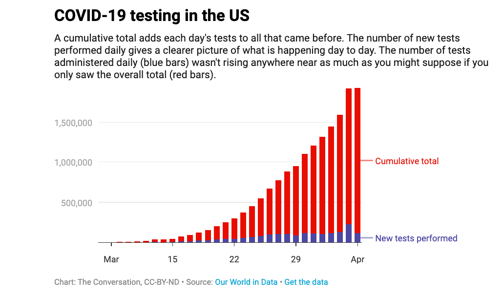
When you graph the number of new tests by date, you can see the number of COVID-19 tests performed between March and April did increase through time, but not rapidly. This instance is one of many when important information was not properly understood or well communicated.
As a researcher of hazard and risk communication, I think a lot about how people interpret the charts, graphs and maps they encounter daily.
Whether they show COVID-19 cases, global warming trends, high-risk tsunami zones, or utility usage, being able to correctly assess and interpret figures allows you to make informed decisions. Unfortunately, not all figures are created equal.
If you can spot a figure’s pitfalls you can avoid the bad ones. Consider the following three key questions the next time you see a graph, map or other data visual so you can confidently decide what to do with that new nugget of information.
What is this figure trying to tell me?
Start by reading the title, looking at the labels and checking the caption. If these are not available – be very wary. Labels will be on the horizontal and vertical axes on graphs or in a legend on maps. People often overlook them, but this information is crucial for putting everything you see in the visualization into context.
Look at the units of measure – are they in days or years, Celsius or Fahrenheit, counts, age, or what? Are they evenly spaced along the axis? Many of the recent COVID-19 cumulative case graphs use a logarithmic scale, where the the intervals along the vertical axis are not equally spaced. This creates confusion for people unfamiliar with this format.
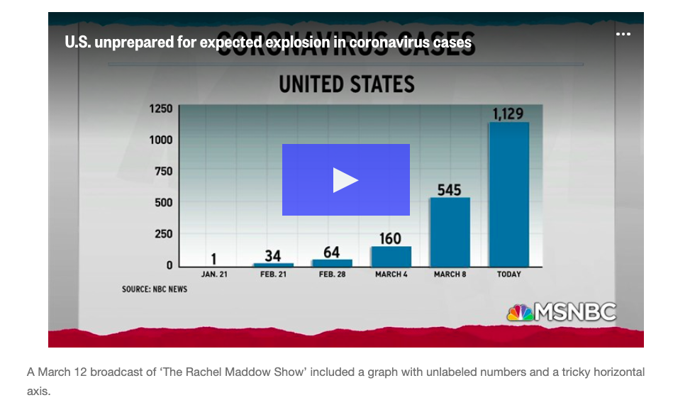
For instance, a graph from “The Rachel Maddow Show” on MSNBC, showed coronavirus cases in the United States between Jan. 21 and March 11. The x-axis units on the horizontal are time (in a month-day format) and the y-axis units on the vertical are presumably cumulative case counts, though it does not specify.
The main issue with this graph is that the time periods between consecutive dates are uneven.
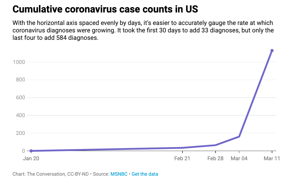
Chart: The Conversation, CC-BY-ND Source: MSNBC
In a revised graph, with dates properly spaced through time, and coronavirus diagnoses plotted as a line graph, you can see more clearly what exponential growth in the rate of infection really looks like. It took the first 30 days to add 33 cases, but only the last four to add 584 cases.
What may seem like a slight difference could help people understand how quickly exponential growth can go sky high and maybe change how they perceive the importance of curbing it.
How are color, shape, size and perspective used?
Color plays an important role in how people interpret information. Color choices can make you notice particular patterns or draw your eye to certain aspects of a graphic.
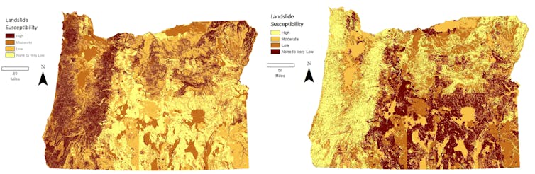
Consider two maps depicting landslide susceptibility, which are exactly the same except for reversed color schemes. Your eye may be be drawn to darker shades, intuitively seeing those areas as at higher risk. After looking at the legend, which color order do you think best represents the information? By paying attention to how color is used, you can better understand how it influences what stands out to you and what you perceive.
Shape, size and orientation of features can also influence how you interpret a figure.
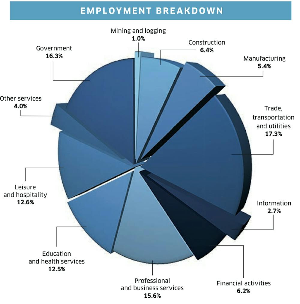
Pie charts, like this one showing employment breakdown for a region, are notoriously difficult to parse. Notice how hard it is to pull out which employment category is highest or how they rank. The pie chart’s wedges are not organized by size, there are too many categories (11!), the 3D perspective distorts the wedge sizes, and some wedges are separate from others making size comparisons almost impossible.
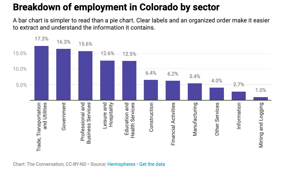
A bar chart is a better option for an informative display and helps show which industries people are employed in.
Where do the data come from?
The source of data matters in terms of quality and reliability. This is especially true for partisan or politicized data. If the data are collected from a group that isn’t a good approximation of the population as a whole, then it may be biased.
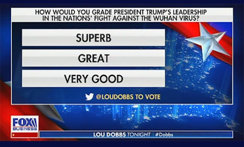
For example, on March 18, Fox Business Network host Lou Dobbs polled his audience with the question “How would you grade President Trump’s leadership in the nation’s fight against the Wuhan Virus?”
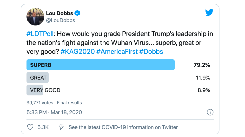
Imagine if only Republicans were asked this question and how the results would compare if only Democrats were asked. In this case, respondents were part of a self-selecting group who already chose to watch Dobbs’ show. The poll can only tell you about that group’s opinions, not people in the U.S. generally, for instance.
[Get facts about coronavirus and the latest research. Sign up for The Conversation’s newsletter.]
Then consider that Dobbs provided only positive responses in his multiple choice options – “superb, great or very good” – and it is clear that this data has a bias.
Spotting bias and improper data collection methods allows you to decide which information is trustworthy.
Think through what you see
During this pandemic, information is emerging hour by hour. Media consumers are inundated with facts, charts, graphs and maps every day. If you can take a moment to ask yourself a few questions about what you see in these data visualizations, you may walk away with a completely different conclusion than you might have had at first glance.
Carson MacPherson-Krutsky, PhD Candidate in Geosciences, Boise State University
This article is republished from The Conversation under a Creative Commons license. Read the original article.