In this section we review guidelines for communicating effectively in-person during presentations, electronically through email, phone, voicemail, and text, as well as on paper with letters and memos.
Guidelines for Effective Communication
Effective Presentations
Do’s and Don’ts
One skill that employers look for in students is their ability to present in front of a group. This method of communication is a way for a new hire to become known in the organization. This is how you prove your professionalism and knowledge. Here are a few Do’s and Don’ts of presenting.
Do
- Know your material. If you are well prepared, you will be able to talk with, not read to, your audience. Use the key words on your slides to prompt you on what to say next. If using Power Point, use speaker’s notes.
- Look professional. Dress appropriately, comb your hair, remove your hat, and check to see that everything is in its place.
Face the audience, not your visual aid. If using PowerPoint, refer to the computer console. Don’t turn your back to the audience and read from the screen on the wall. - Prepare for questions. Your audience is there for a reason and there probably will be people who want to know more about your presentation than you presented. Think beforehand about what these questions may be and how you can respond to them.
- Repeat or restate the question. Repeat or restate the question to confirm your understanding of the question and so that everyone in the audience hears the question.
- Maintain eye contact. Look at the people in the audience. Look at an individual for just a second before looking at another. Eye contact will generate audience interest, promote a conversational style, encourage natural delivery, and instill confidence.
Don’t
- Don’t read a script or the slides to the audience. Talk with them; don’t read to them. A quote here or there is fine, as is reading a point word for word to emphasize it. Aside from that, talk with your audience.
- Don’t create distractions. If you tend to jangle coins in your pocket, empty your pockets before presenting. If you click your pen, use a pencil or a non-clicking pen.
- Don’t stand in front of what you are showing. Make sure you are not in the light beam of the projector. If using posters or other visual aids, make sure you stand to the side so people can see them.
- Don’t chew gum.
Preparing the Slides
An important aspect of delivering effective presentations is creating clear, succinct, audience- friendly slides. Consider that you are telling a story, and be very intentional about the order of presenting your information. Then, keep the slides themselves simple and visually pleasing so they help your listeners stay focused and interested. It is all about planning and designing.
When planning your presentation, keep in mind the following:
- Start by considering the audience. Plan to speak to their interests. Use vocabulary appropriate to the education level of the group. Make sure you avoid or define jargon and technical terms.
- Organize your presentation. Start with an introduction of the topic; continue with the body which includes findings, data, application, and examples; and then end with a conclusion or summary.
- Minimize the number of slides you use.
- Use one slide to convey one idea. Each slide should illustrate only one idea and its supporting points.
- Use only keywords or phrases. Slides should not contain every word of your presentation. Think of your slides as an outline that you use to prompt yourself to speak extemporaneously. They also act as visual signals for the audience to help them focus in on what you are saying.
When designing your slide layout, there are numerous design rules to consider.
Here are a few of the most important:
- Use the 6 x 6 Rule: Keep the number of lines per slide to six or less and the number of words per line to six or less.
- Use font size 24 points or larger; line thickness should be at least 2 points. Use fonts of 48-54 for main titles, 36-44 for slide titles, and 24-36 for text.
- Use contrasting colors with either a very light background and very dark lettering, or very dark background with very light lettering. Dark colors to use include black, dark brown, navy blue, and dark purple. Light colors that contrast well with these are white and yellow.
- Give your slides variety. All-text presentations are boring. Use relevant graphs, photos, and clip art when appropriate. Avoid unnecessary sound effects, slow transitions, and moving graphics. Use visuals such as flow charts, tables, or figures where appropriate to engage your audience in the topic, or explain complex processes.
- Don’t overdo it. Stick with simple backgrounds and templates, and avoid the razzle- dazzle colors and patterns. Also, use lots of white space.
- Use a consistent, professional format.
- DON’T YELL AT YOUR AUDIENCE! Do not capitalize every word in the slide.
- Add a slide title in the same place for each slide. In PowerPoint, put the presentation title and author on the “Slide Master” (On the View menu) so that it automatically will be placed on all slides. Adding a page number there is also a good idea.
- Use spell-check, double-check for consistent capitalization, and proofread!
When using bullets:
- use the same type of bullets for all slides
- try not to break the text across the line
- do not put a period or comma at the end of bullets
- keep bullets grammatically parallel. If the first bullet starts with a verb, all bullets should start with verbs. If the first bullet is a noun, all bullets should be nouns
The popularity of e-mail in today’s society makes it an active form of communication. As such, we have now come to think of it as a standard business tool. Many of the same rules of writing apply, along with the following guidelines to increase the efficiency of this tool.
- Check your e-mail regularly, especially when working with other students on projects.
- Reply promptly with the original message attached or included.
- Don’t reply if you are angry. Give yourself time to calm down before sending e-mail.
- Don’t expect an immediate reply. If something is urgent, use the phone.
- Don’t “Reply to All” when answering e-mail unless it is approved and appropriate.
- Don’t send or forward obscene, offensive, threatening, or defamatory e-mails.
- Reference attachments that are clearly titled in the body of your message. (i.e. “Quarter 2 Sales Summary” is better than “Sales File”.
The key point to remember is this: people form an opinion of you from your writing. Whether it is formal or informal communication, it should never be sloppy or disrespectful unless that is how you really want people to know you.
Additional Suggestions for Writing Email

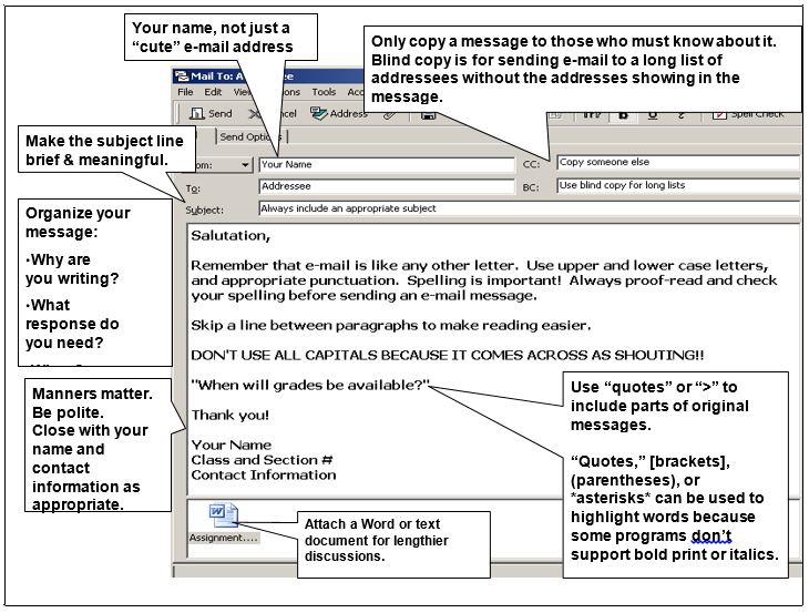
- From: use your name, not just a “cute” email address
- CC: only copy a message to those who must know about it. Blind copy is for sending email to a long list of addresses without the addresses showing in the message.
- Subject: make the subject brief and meaningful.
- Body of message: Include a salutation at the beginning of your message. Organize your message to state why you are writing and what response you need. Remember that email is list any other letter. Use upper and lower case letter, and appropriate punctuation. Spelling is important! Always proof-read and check your spelling before sending an email message.
- Readability: Skip a link between paragraphs to make reading easier. DON’T USE ALL CAPITAL LETTERS BECAUSE IT COMES ACROSS AS SHOUTING! Use “quotes” or “>” to include parts of original messages. “Quotes,” [brackets], (parentheses), or *asterisks* can be used to highlight words because some programs don’t support bold print or italics.
- Closing: Manners matter. Be polite. Close with your name and contact information as appropriate.
- Attachments: Attach a word or text document for lengthier discussions.
Email Salutations
Consider these guidelines for email salutations:
An e-mail message may not require a salutation, especially when (1) the message is being distributed to a number of people within an organization or (2) the message consists of an impersonal announcement about a change in policy or procedure. A salutation is desirable, however, when your message might otherwise appear cold and impersonal.
Examples of Salutations
- When writing to someone you know, the salutation can take a number of forms and it may be followed by a comma rather than a colon. For example: “Tim, Dear Tim, Hello Tim, Hi Tim,”
- As an alternative to inserting a salutation on a line by itself, you can incorporate the person’s name in the opening of the message. For example: “You’re right, Tim. The meeting starts at 8:00 a.m.”
- When you are writing to someone you don’t know or someone with whom you still have a formal relationship, use a formal salutation and follow it with a colon. For example: “Dear Ms. Smith: OR Dear Judy Smith: Dr. Johnson:”
Telephone and Voicemail
Speaking on the telephone should be second nature to us all, but the proper method for business communication requires a more formal approach than in chatting with a friend. Depending on whom you are calling and for what purpose, it is important to consider the following points.
Business Phone Calls
When making a business phone call:
- Identify yourself when the target person answers the phone.
- Ask if it is a good time to discuss the issue or ask your question; if the person is rushed you may not get the answer you’d like.
- If the timing is good, clearly and succinctly ask your question or state your business.
- Clarify any instructions or details that might be confusing.
- Summarize and confirm what has been agreed upon.
- End your call professionally, thanking your contact for his or her help.
- If an administrative assistant or other support person answers the phone, be as polite and specific as you would with the target person. Administrative assistants can be a big help, and should never be considered unimportant in the communication cycle.
It is also inevitable in our busy lives that you will be leaving a voice message. Don’t panic, and be prepared for this common communication mode.
Voice Mail
- Before you place the call, be aware you may need to leave a message.
- Clearly and briefly state your name, the name of your business, the time and date of your call.
- State the purpose of your call.
- Specify when you will be available for a return call and clearly and slowly speak your phone number, or email address as an alternative contact method.
- Thank the target person, and repeat your full name and phone number to guarantee he/she noted it correctly.
Text
Guidelines for Texting Etiquette
Text messaging can be an efficient means of communicating in business. It provides an instant and convenient means of communicating. Common uses include providing quick, brief notices or changes or information such as letting someone know you’re on your way a meeting/luncheon or to let them know you emailed them important documents. When texting for a business-related matter, consider these etiquette guidelines:
- Be Professional – Keep language appropriate to your audience and avoid informal abbreviations such as “2” for the word “too/to/two” and “u” for the word “you”.
- Check your grammar and spelling – Check you text thoroughly before sending. Errors reflect on you and the company.
- Think about timing – While many people often keep their mobile phone with them, they may not want to be contacted at inopportune times. Sending texts “out of hours” may not appear professional.
- Allow for brief responses – Make it easy for the receiver to respond. Avoid asking something that cannot be easily replied to by text.
- Keep the message concise – Texting is designed for short message displayed on a small screen. Use other means such as email to send documents and complex information.
- Don’t expect an immediate reply – The person may not be available or able to receive and read texts.
- Use positive tone – When texting a short message quickly, you may not think about your tone that may sound harsher than intended. Write in complete sentences to prevent sounding abrupt.
Don’t let texting replace other methods of communication. Consider whether a face-to-face meeting or phone call will better achieve your purpose. Both methods help build rapport better than a text message.
Business Letter Formats
Personal Block Letter Format
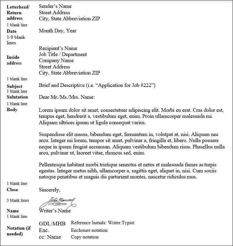
A Personal block letter format includes the following nine sections with at least one blank line between the sections and between body paragraphs:

- Letterhead/Return Address: Sender’s name, Street address, city, state abbreviation, zip (list on three lines)
- Date: Month Day, Year (follow by 1-9 blank lines)
- Inside Address: Recipient’s name, Job title/department, Company address, city, state abbreviation, zip
- Subject: Brief and descriptive (i.e. “Application for Job #222”)
- Salutation: Dear Mr., Ms., Mrs., Name:
- Body: Single spaced paragraphs separated by a blank line
- Close: Sincerely, (followed by 3 blank lines so there is space for a physical signature)
- Name: Writer’s Name
- Notation (if needed): GDL: MHB (reference initials: writer: typist), Enc. (enclosure notations), cc: Name (Copy notation)
Letterhead/Formal Block Letter Format
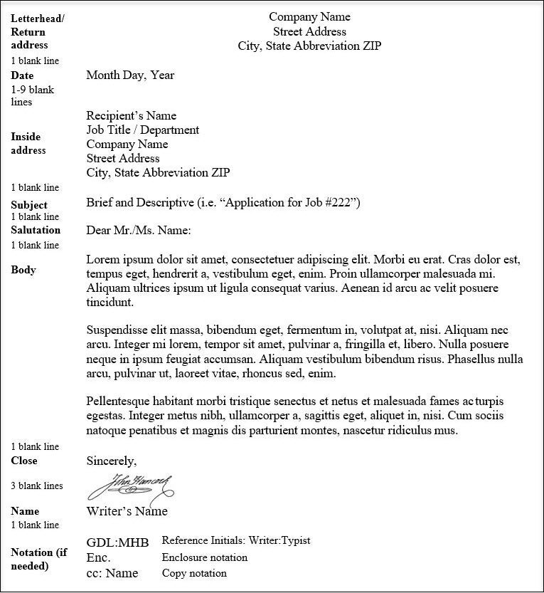
A Personal block letter format includes the following nine sections with at least one blank line between the sections and between body paragraphs:

- Letterhead/Return Address: Company name, Street address, city, state abbreviation, zip (center and list on three lines)
- Date: Month Day, Year (follow by 1-9 blank lines)
- Inside Address: Recipient’s name, Job title/department, Company address, city, state abbreviation, zip
- Subject: Brief and descriptive (i.e. “Application for Job #222”)
- Salutation: Dear Mr., Ms., Name:
- Body: Single spaced paragraphs separated by a blank line
- Close: Sincerely, (followed by 3 blank lines so there is space for a physical signature)
- Name: Writer’s Name
- Notation (if needed): GDL: MHB (reference initials: writer: typist), Enc. (enclosure notations), cc: Name (Copy notation)
Letter Salutation Guidelines
As a general rule, follow these salutation guidelines:
- Follow the salutation with a colon, unless addressing a person by first name only, and then follow with a comma.
- Omit the salutation if you are using the simplified style, and replace it with a subject line.
- Abbreviate only the titles Mr., Ms., Mrs., and Dr. and their plural forms. Spell out all other titles, such as Professor and Father.
- Capitalize the first word as well as any nouns and titles in the salutation; for example. Dear Mrs. Smith, Dear Sir.
- Be sure that the spelling of the surname in the salutation matches the spelling in the inside address. If the person you are writing to has a hyphenated last name (for example, Mrs. Hazel Gray-Sparks), the salutation should include the entire last name (Dear Mrs. Gray-Sparks).
- In salutations involving two people, use and, not &, between the names. In salutations involving three or more people, separate the names with commas and insert and, not &, between the last two names.
- If you don’t know a person’s name or gender, avoid “To whom it may concern.” Instead, use the job title or a generic greeting. For example, Dear Recruiter: Dear Claims Adjustor:
- For a simplified business letter, use a subject in all capital letters, followed by the body of the letter.
Here are common salutation situations
To One Person (Name, Gender, and Personal Title Preference Known)
- Dear Mr. Smith:
- Dear Ms. Simpson:
To One Person (Name Known, Gender Unknown)
- Dear Pat Parker:
- Dear R. V. Moore:
To One Woman (Personal Title Preference Unknown)
- Dear Ms. Malloy:
- Dear Rhonda Malloy:
To Several Persons
- Dear Mr. Anderson, Mrs. Brodsky, and Dr. Denver:
- Dear Friends (Colleagues, Members, or some other
appropriate collective term):
To Two or More Men OR To Two or More Women
- Dear Mr. Gelb and Mr. Harris:
- Gentlemen:
- Dear Messrs. Gelb and Harris: (more formal)
- Dear Mrs. Allen, Ms. Whitley, and Miss Smith:
- Dear Mrs. Wallace and Mrs. Drum
Memos
What is a memo?
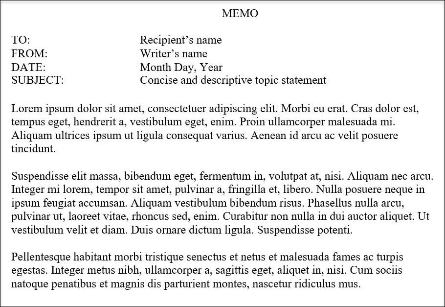
- A “memo” (short for “memorandum”) is generally considered to be less formal than a letter and is often used for communication within a company or organization.
- Companies will often have templates for memos.
- Most memos contain a title (such as “Memo” or “Interoffice Correspondence”) and use “To,” “From,” “Date,” and “Subject” headings.
- Memos often do not use salutations (“Dear…”), complimentary closes (“Sincerely,…”), or signature boxes.
- Memos allow you to maintain a “paper trail” of communication.
