Graphics are a fantastic way to add visual interest to your content and also motivate people to review your content more closely. They help you condense complex ideas into a more digestible format.
Infographics are a popular format since they can convey a lot of information in an organized, and visually appealing way. However, if you are only providing your content within an infographic you are cutting off a portion of your audience.
While graphics are helpful to many users, to be truly effective and accessible, they require a logical structure, meaningful graphics, accessible colors, and a text description. Follow these tips to make your next infographic more accessible for your readers.
Gather and Organize your Data
Infographics benefit from following a logical structure. This means your information is organized in a way that makes sense and is predictable for your reader to interpret. It’s easy to follow from one piece of information to the next and understand the main message of the infographic without too much effort. Another benefit of having a logical structure is it’s easier to translate into a text description. For example, your infographic sections become your text’s heading sections. Need help getting started? Use this Google Docs template to outline your infographic content.
What’s your story?
Before you jump into the design of your infographic, take some time to outline your story and decide how it’s going to be structured. For example, if you want to tell a story about the types of media files uploaded to Boise State’s website, you first need to gather your raw data:
- Audio files – 32
- Image files – 33,643
- Video files – 1,152
- Documents – 8,596
From here, you can decide how to organize the content. Choices include alphabetical order by file type, or numerical order by number of files.
Meaningful Graphics
After you have your data, you can then decide what type of graphics you want to represent your content. For the file type example, you might choose to create something like a bar graph comparing the totals to one another.
Or you might select an icon to represent the category and list the number label. However you decide to visualize your data, the graphic should be meaningful and easy to interpret.
For the example story of file types published on the Boise State website, you could select icons that represent the different files. For example, a speaker for audio, a snapshot for an image, a play button for video, or a piece of paper for documents.
If you can’t think of any ideas for icons, visit The Noun Project to search for ideas.
Accessible Colors
Brand Colors
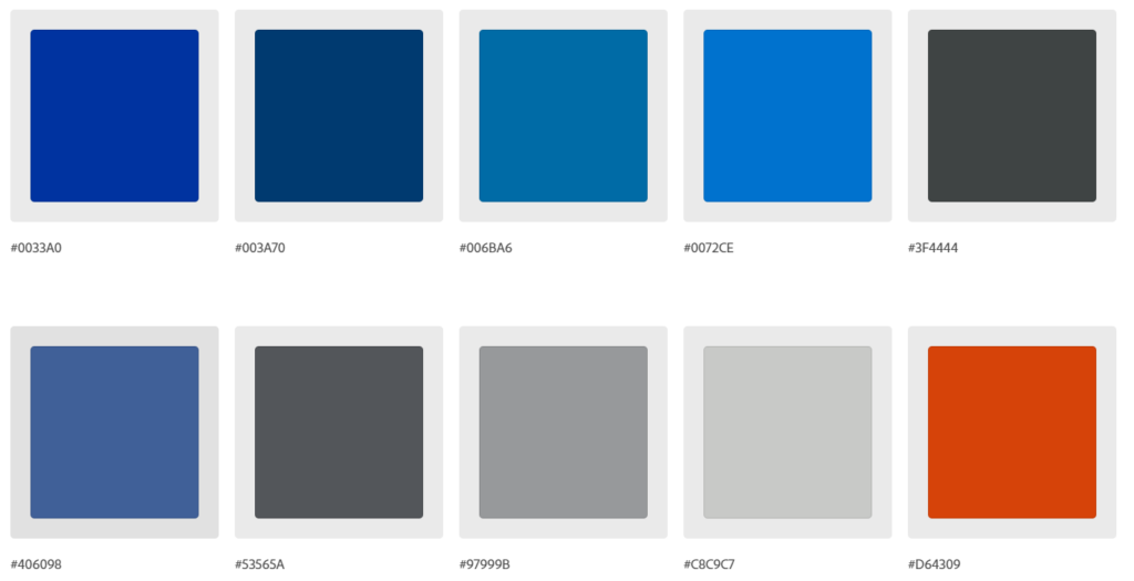
The colors you use impact accessibility in a variety of ways. You need enough contrast to make the information stand out for users. Boise State has accessible digital colors (Figure 1) available for your projects. For details, check out Boise State Brand Standards – Colors.
Check for Contrast
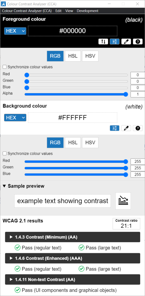
If you have questions about your contrast, use a contrast checker like the one available from the Paciello Group (Figure 2) to verify your background and foreground colors meet accessibility requirements. To download, visit the Paciello Group – Colour Contrast Analyzer.
Add Labels to Content
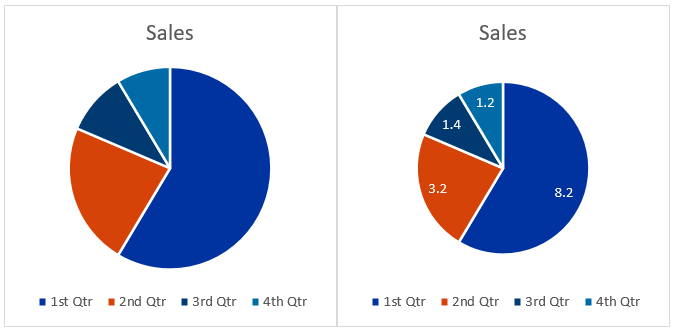
Lastly, remember that using color alone to convey meaning is not accessible. If you create a graph or chart for your infographic, add labels or texture or something to help users understand the information without relying on color alone. See Figure 3 for example.
Publish with Text Descriptions
After you have gathered your data and outlined your story, added meaningful graphics, and ensured your colors are accessible, you can publish your infographic along with a brief alternative text description and a text description on the same page. Use these tips as a guide for publishing your infographic on the Boise State website.
- Title: provide the name of your infographic in the page title or include a section heading
- Image file: upload your image and include an alternative text description, for example “name of infographic, see page for text description”
- Link to media file: link to the media file and include a caption description, for example “Select to view full image”
- Text description: provide the full text description of your infographic and include appropriate section headings
- Optional PDF: If you think your users want or need a downloadable version of your infographic, you can include a PDF. Before publishing your PDF document, perform an accessibility check and resolve as many errors as possible. Lastly, clearly label your link as a downloadable PDF.
Pulling it all together!
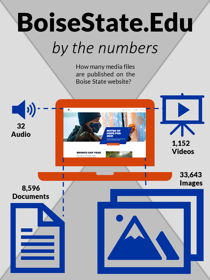
BoiseState.Edu By the Numbers
How many media files are published on the Boise State website?
- 32 Audio Files
- 1,152 Video Files
- 8,596 Documents
- 33,634 Images