Presenting data in a graphical format is a good way to present complex information into a more manageable format for readers to understand and comprehend. However, if you don’t plan for accessibility from the beginning, you may produce graphs that leave many in your audience behind.
The good news is with a few simple steps you can create accessible graphs and datasets that work for everyone. Use the following guide to make your next data project more accessible.
All figures provided are examples only and not based on real figures.
Provide Data Labels on Graphics
Adding data labels to your graphs is a great way to make the information easier for users to understand. Providing data labels is usually an easy addition in a variety of programs that generate graphs from a data set, and having the labels on the graph allows users to interpret the data more easily and accurately.
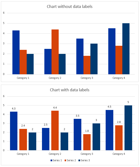
Figure 1 provides an example of two bar charts, one without data labels and one with data labels.
Figure 1 – Data Labels
Provide Text Descriptions or Data Tables for Graphics
With your data labels on your charts and graphs, visual users can more easily interpret the content. However, depending on the quality of your graphic, the labels may be difficult for some users to interpret and for non-visual users, impossible without a text description.
Adding a heading before the graphic also helps draw attention and provides a quick navigation point for your users. Figure labels also help users connect any references in the text with the correct graphic.
There are a few different ways to include the text description with your graph.
- Provide an alternative text description – this is a good option for simple graphs with few data points (see Figure 2)
- Provide a caption – this is also a good option if you have a relatively simple graph and makes the text description available to all users (see Figure 3)
- Text description on the page – this is the best option for more complex graphs and may require displaying data in a table (see Figure 4)
- Link to external text description – this is an option if you have complex data and possibly space limitations on your page or graph for labels or full descriptions (see Figure 5)
Figure 2 – Number of Files Published on Boise State Website
In this first example, we have a pie chart with data labels. We included a heading with the name of the figure, added a figure label in the caption and an alt text description of “Pie chart of Files published on BoiseState.edu – 0% audio files, 3% video files, 20% documents, 77% images.”
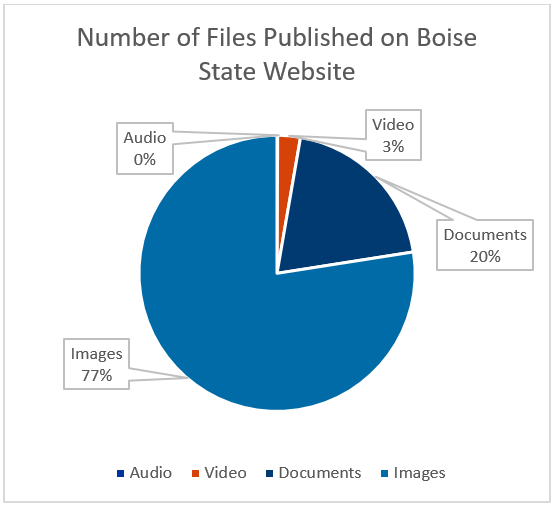
Figure 3 – Number of Files Published on Boise State Website
In this example, we have the same pie chart but have added the description in the caption so it’s visible for all users. The alt text description now describes the type of chart. For example “Pie Chart of file types.” The figure label in the heading and in the caption provides a quick way for users to identify the relevant figure.
Figure 4 – Number of Files Uploaded by Month
In this example, we have a bar chart outlining the number of video, document, and image files uploaded by month for January, February, March, and April. We’ve included data labels on the chart and a figure label in the caption.
The alternative text description includes a brief description of the chart and directs users to find the full text description on the page. Example, “Bar chart of files uploaded by month – see table 1 for full-text description.”
Below the chart, we’ve included a description and a table for users to review the date. We’ve also included a heading to identify the table as referenced in the alt text description.
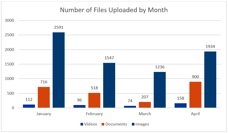
Table 1 – Data Figure 4
Total number of video, document, and image files uploaded to the website during the months of January through April.
| Category | January | February | March | April |
|---|---|---|---|---|
| Videos | 112 | 96 | 74 | 158 |
| Documents | 716 | 518 | 207 | 900 |
| Images | 2591 | 1547 | 1236 | 1934 |
Figure 5 – Line Chart with Multiple Data Points
In this example, we have a line chart outlining the webpage views by month for eight different sites. Since the chart contains a large amount of data, adding labels for each data point is not possible.
To accommodate for this, we’ve adjusted the lines to include a unique identifier and added a caption that contains both the figure label and a note that directs users to the table description if they need the data.
The alternative text description includes a brief description of the chart. For example, “Line chart of files uploaded by month”
Below the chart, we’ve included a description and a table for users to review the date. We’ve also included a heading to identify the table as referenced in the alt text description. Lastly, we’ve included a link to a Google Sheets version of the data that’s been run through an accessibility checker.
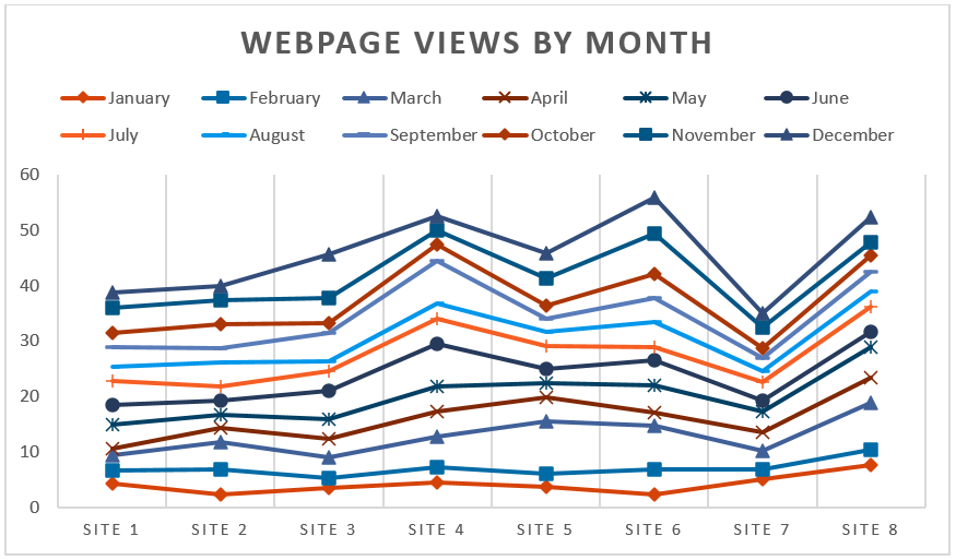
Table 2 – Data for Figure 5
Figures represent the number of unique pageviews in the thousands. Open Figure 5 Data in Google Sheets
| Site | January | February | March | April | May | June | July | August | September | October | November | December |
|---|---|---|---|---|---|---|---|---|---|---|---|---|
| Site 1 | 4.3 | 2.4 | 2.7 | 1.2 | 4.3 | 3.7 | 4.3 | 2.4 | 3.7 | 2.4 | 4.5 | 2.8 |
| Site 2 | 2.5 | 4.4 | 4.9 | 2.5 | 2.5 | 2.5 | 2.5 | 4.4 | 2.5 | 4.4 | 4.3 | 2.4 |
| Site 3 | 3.5 | 1.8 | 3.7 | 3.5 | 3.5 | 5.1 | 3.5 | 1.8 | 5.1 | 1.8 | 4.5 | 7.7 |
| Site 4 | 4.5 | 2.8 | 5.5 | 4.5 | 4.5 | 7.7 | 4.5 | 2.8 | 7.7 | 2.8 | 2.7 | 2.4 |
| Site 5 | 3.7 | 2.4 | 9.4 | 4.3 | 2.7 | 2.4 | 4.3 | 2.4 | 2.4 | 2.4 | 4.9 | 4.4 |
| Site 6 | 2.5 | 4.4 | 7.8 | 2.5 | 4.9 | 4.4 | 2.5 | 4.4 | 4.3 | 4.4 | 7.2 | 6.4 |
| Site 7 | 5.1 | 1.8 | 3.3 | 3.5 | 3.7 | 1.8 | 3.5 | 1.8 | 2.5 | 1.8 | 3.7 | 2.4 |
| Site 8 | 7.7 | 2.8 | 8.4 | 4.5 | 5.5 | 2.8 | 4.5 | 2.8 | 3.5 | 2.8 | 2.5 | 4.4 |
Simplify Data Tables
As much as possible, aim to keep your data tables free of merged cells or too much data. Consider instead, breaking your data into smaller tables that are easier for users to follow. Then you can use headings to help users understand what each table represents. Consider the following examples in Tables 3 and 4.
Table 3 – Merged Rows
In this table, the first three rows are merged for the three schools to group the undergraduate and graduate student groups for each. These merged cells can make reading and interpreting data more difficult for some users. If the merged rows are not coded correctly, it can be impossible for non-visual users to navigate successfully with a screen reader.
| School | Student Group | Enrollment | Change from previous year |
|---|---|---|---|
| Cedar University | Undergraduate | 103 | +7% |
| Graduate | 20 | +9% | |
| Elm College | Undergraduate | 214 | +17% |
| Graduate | 11 | +13% | |
| Pine Academy | Undergraduate | 120 | +1% |
| Graduate | 52 | +15% |
Table 4 – Small Groups of Tables
Compared to Table 3, in this example, we’ve broken our data into three individual tables and included a heading before each one. We can also remove the merged cells because the entire table is for one school. The header row is tagged correctly and the heading provides a navigation point for users to scan the content more quickly.
Table 4.1 – Cedar University Percent Change in Enrollment
| Student Group | Enrollment | Change from previous year |
|---|---|---|
| Undergraduate | 103 | +7% |
| Graduate | 20 | +9% |
Table 4.2 – Elm College Percent Change in Enrollment
| Student Group | Enrollment | Change from previous year |
|---|---|---|
| Undergraduate | 214 | +7% |
| Graduate | 11 | +9% |
Table 4.3 – Pine Academy Percent Change in Enrollment
| Student Group | Enrollment | Change from previous year |
|---|---|---|
| Undergraduate | 120 | +7% |
| Graduate | 52 | +9% |
Additional Resources
The examples provided here were fairly simple and can’t represent the wide variety of graphics available to represent data. We also didn’t cover the range of tools available to generate graphics. Whether you are using something like Microsoft Excel or Google Sheets to create more simple graphs or something like Tableau to generate dashboards, you can find resources for making your content more accessible. Use the following resources as a guide and contact us if you have questions.
General Accessibility Guidelines for Tables and Complex Images
Tools for Generating Data Graphics
- Publish Data Tables with TablePress
- Microsoft Excel Accessibility
- Tableau User Guide
- Tableau Accessibility
Questions?
If you have questions about how you can make your next data project more accessible before publishing, reach out to us at OITAccessibility@BoiseState.edu.