In a previous post we covered tips for describing data and graphs in an accessible way. This includes providing text descriptions for images and simplifying your data tables.
These tips apply mainly to static information like images, tables, and text but can be helpful for more interactive types of data, like those provided in an interactive dashboard.
Why visualize data?
Data visualization tools, like Tableau, allows you to create interactive data visualizations and dashboards to display your data right on a webpage. This approach can be particularly helpful for content that updates frequently or has a lot of information you want users to understand quickly.
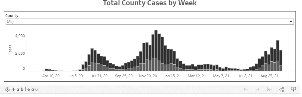
For example, Boise State’s COVID-19 Tracking Dashboard provides a way for users to view updates about information relevant to the campus community in a visual way.
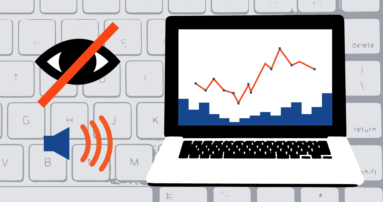
If not created with accessibility in mind, data visualizations and dashboards can create a confusing experience for users. Some of the common issues with dashboards are associated with reading order, color contrast, and labels.
Why is reading order important?
The most common accessibility issue with dashboards is a confusing reading order. Imagine you are reading a menu at a restaurant and the menu items and menu prices don’t match up in a logical way. It can be difficult to know the price of the different items.
The same is true for a dashboard if you can’t perceive the relationships visually. If you are listening to the information and it is not presented in a logical reading order, you may not know for sure what a particular piece of data means.
Improve reading order in your dashboards
Add content to your dashboard in a logical manner. The reading order of your dashboard often mirrors the way content was added during the editing process. If you skip around or add content out of order, the reading order for end users may become jumbled and difficult to follow.
To check the reading order of your dashboard use the tab key on your keyboard to navigate through the content.
Example video of screen reader user navigating a dashboard
In this video, a screen reader user navigates through a dashboard with an unclear reading order. You’ll notice the reading order doesn’t follow a logical reading order and the user starts with the data in the middle of the dashboard, then moves towards the beginning before jumping towards the end. This confusing reading order is often a function of the tool used to create the dashboard and can be set during the design phase.

Why is color contrast important?
If there is not enough contrast between the colors in your dashboard, some users may struggle to interpret the information accurately. This affects users who have some form of color vision deficiency, or those who are viewing the dashboard on a device with high contrast or grayscale colors.
Figure 1 demonstrates what a section of the Boise State COVID-19 Tracking dashboard looks like in grayscale. There is enough contrast between the two colors on the graph that they are easily distinguishable even in grayscale.
What can you do to improve color contrast in your dashboards?
Using Boise State’s accessible digital color palette or the optional color blind template within Tableau to ensure you meet contrast requirements in a dashboard.
Using a Color Contrast Checker is also a good way to ensure you are meeting contrast requirements.
Why are labels important?
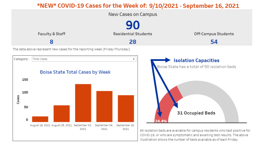
Labels are essential for ensuring content is accessible. Labels provide context for users to read, interpret, and understand the information presented. In a dashboard, you can label your content by adding clear titles to the different sections of data, providing data labels on charts and graphs, and adding alternative text descriptions to images.
Figure 2 demonstrates how data labels make the information easy to read and understand at a glance. The graph is clearly labeled with the title “Isolation Capacities.” A description adds additional details that “Boise State has a total of 90 isolation beds.” The graph itself has a label to indicate the percent and number of beds currently occupied.
Additional details are provided for what is the purpose of an isolation bed and how often the data is updated.
What can you do to improve labels in your dashboards?
Review all the content on your dashboard to ensure it has a clear label or alternative text description. Turn on data labels in your charts and graphs and don’t rely on hover-over type features that require a user to interact with the data to see more details. If there are too many labels on your data that it interferes with reading, consider limiting the amount of information on your chart or graph.
More information
Making your data visualization accessible at the time of creation will always save you time versus having to make it accessible later.
Visit Webguide to learn about Tableau’s best practices for creating accessible data visualization dashboards, along with steps you can take to test any dashboard for accessibility.