Play underlined text video

Video transcript
Pay attention to this message! You know it’s important because it’s underlined. We often underline text to create a sense of urgency or importance. However, is the information important, a link, or nothing at all?
Underlined text on a page looks like a link so users may try to select it with no success. Underlined text is also not semantic meaning it really doesn’t tell the user anything. If they are listening to the page with a screen reader, there is no difference between plain text and underlined text. Since it looks like a link and doesn’t mean anything, underlining text often has the opposite effect of what you’re trying to accomplish.
Bottom line: Underlined text is not an effective way to emphasize important information.
So what can you do instead?
Headings are an effective way to outline your content, provide navigation points, draw attention to your page, and emphasize important details.
Consider this example

Since the underlined text isn’t semantic, it’s not read out any differently and the words inclusiveness, full access, and standards for accessibility look like they are links.
Compare this to another example
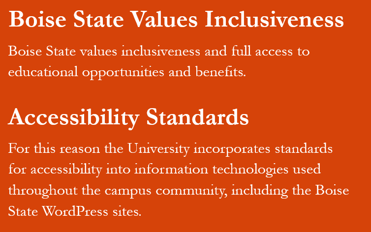
Accessibility Standards (heading) For this reason the University incorporates standards for accessibility into information technologies used throughout the campus community, including the Boise State WordPress sites.
Instead of underlined text, the two sections contain headings that have semantic meaning and are announced as they are read. Headings look different from the other text so our eyes are drawn to them. They also sound different when read aloud so users know they are headings.
Here are two steps to put this concept into practice.
Step 1: Decide what’s important!
Review your information and decide what is the most important, or main sections of your content. This is the information you want to stand out to your readers and could be an action they need to take, a deadline, event information, a safety warning, or a process.
Step 2: Add a strong heading to the beginning of your important section
Once you know what’s important, add a strong heading to the beginning of your section to draw attention to the main point. For example submit request form, applications due Friday, conference details, important safety notice, or application process.
There you have it! Two steps to making your important information stand out by knowing what is important and adding it to your section heading. Now go make the web a better place, one heading at a time.
To learn even more about web accessibility visit us at Boise State Webguide, email OITAccessibility@boisestate.edu, or call us at (208) 426-5628.
Tips for writing better headings

Structure your content in a logical way
As you are organizing your content, remember to provide the information in a logical manner. Some types of organization to consider are alphabetical, chronological, order of importance, or steps in a process.

Add appropriate style tags
You don’t want your text to just look like a heading. You need to tag it to be a heading.
On the web, you can add HTML tags with the visual editor. In documents, you can add tags using the styles menu.

List headings in semantic order
Your content always with a heading 1 as your main page title, and continue with heading 2. On the web, this is your page title. Once you reach heading level 3, you can go up or down a number. Never skip a heading level or use headings for decoration.